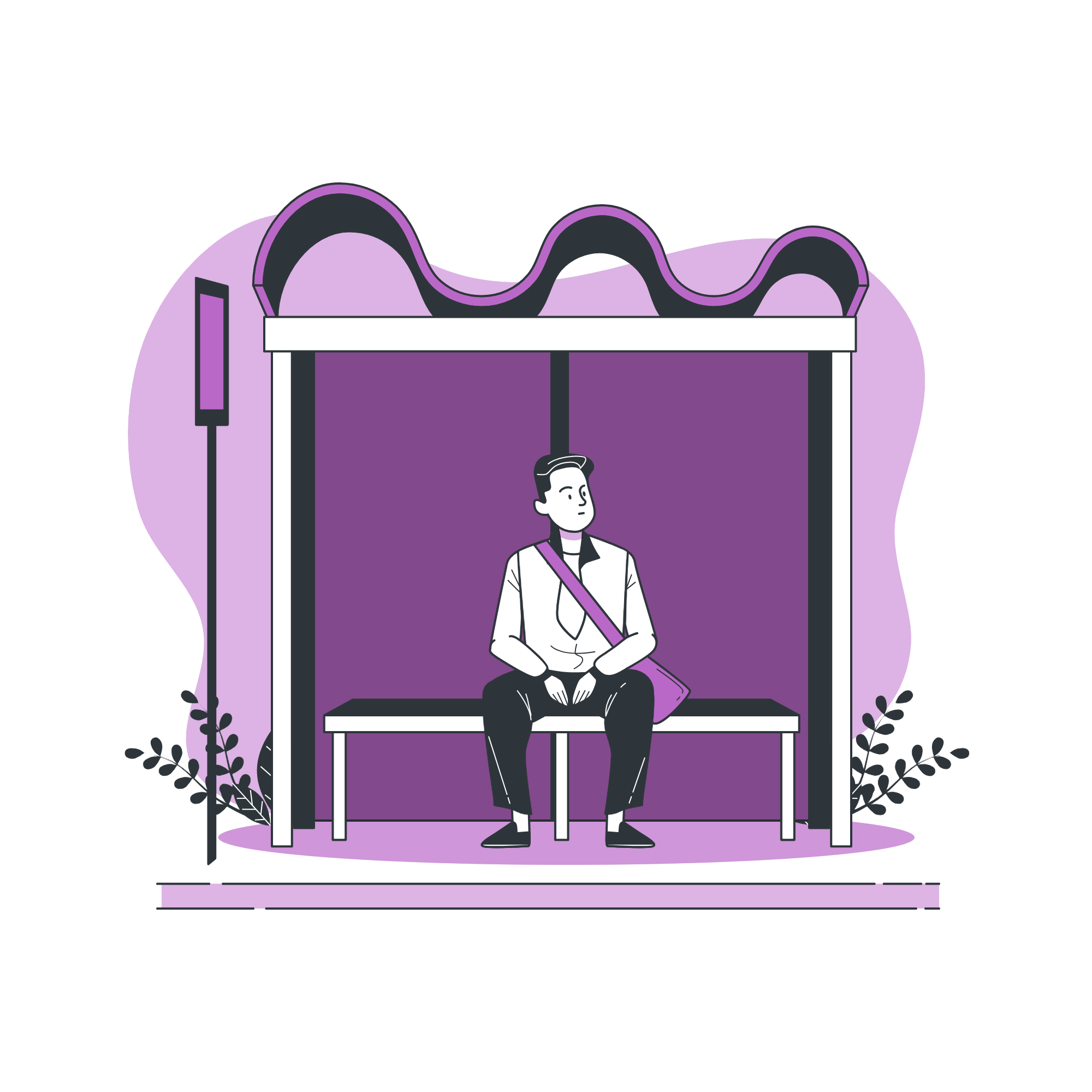
Missed your train again?
Commuting shouldn’t feel like a guessing game.
The Solution
Real-time clarity, right when it matters.
I designed Clear Commute, a mobile transit app that gives Ontario commuters real-time platform updates so they can move with confidence and avoid missed connections.
Timeline:
10 weeks
Tools:
Figma, Figjam, Canva, Miro, Slack, Otter.AI
Roles:
UX/UI Designer, UX Researcher
The Problem
Platform changes happen last minute, and commuters find out too late.

5% of transit platforms change unexpectedly each day, impacting over 15,000 Ontario commuters. Most only learn about it after arriving at the station, when time is already working against them.
Target Users
Built for people who commute with purpose.
Designed for working professionals, university students, and daily transit riders who need real-time platform clarity before they reach the station.
Research
Understanding the moment before panic.
To further understand the issue, I reviewed several key secondary sources and identified the following insights:
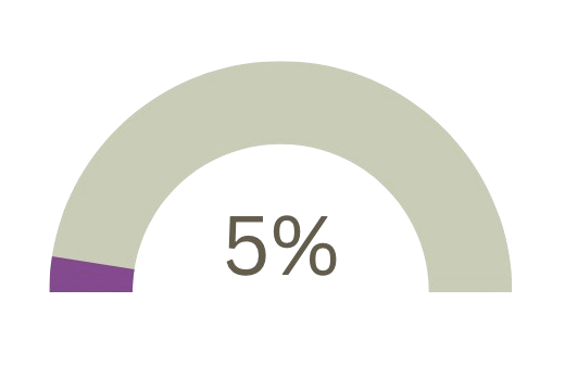
5% of commuters are affected by unexpected or last-minute platform changes, this would translate to more than 15,000 daily riders experiencing delays or missed connections.
Some public transit platform information is typically announced only 10 to 15 minutes before departure.
Others don’t update commuters about platform changes, which leads to scrambles, missed meetings and longer travel times.
Primary Research
What are people saying about the issue ?
Pain Point
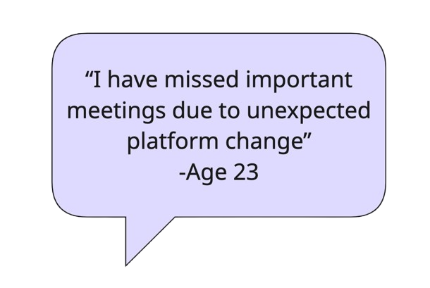

Motivation
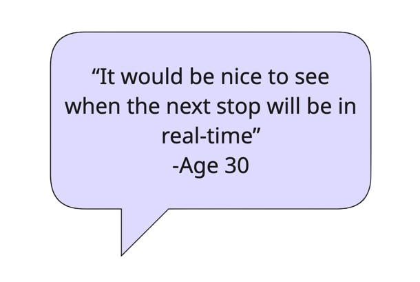

Behaviour
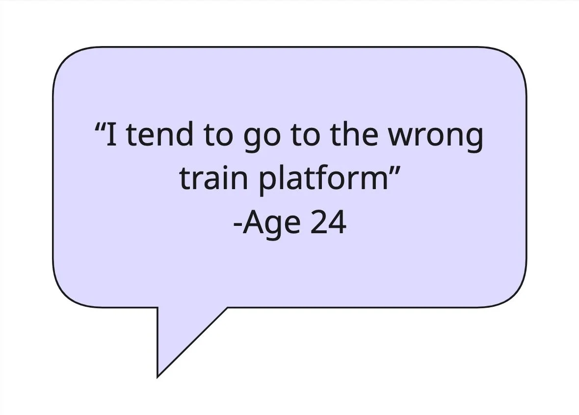
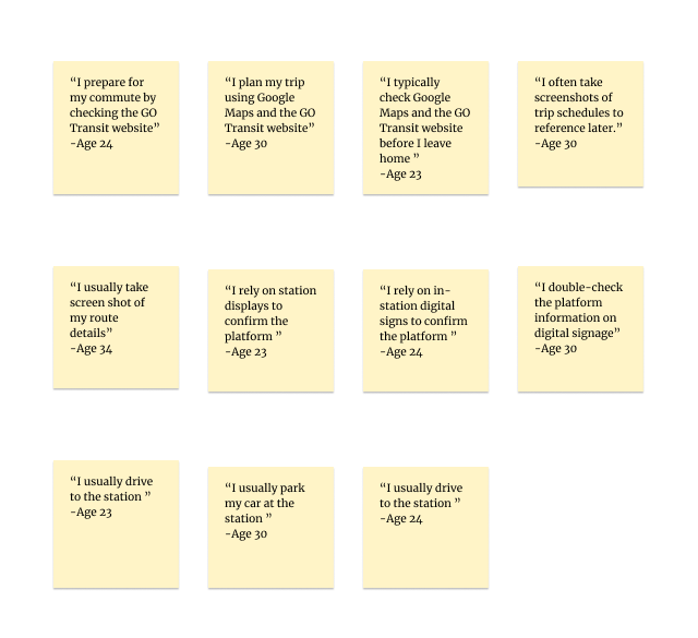
As I listened to commuters’ experiences, a clear pattern emerged and one frustration united them all. The lack of real-time platform information before reaching their platform was the biggest challenge, causing uncertainty and missed connections. This insight became the driving force behind my design decisions, shaping the central theme: Optimized, Real-Time Information.
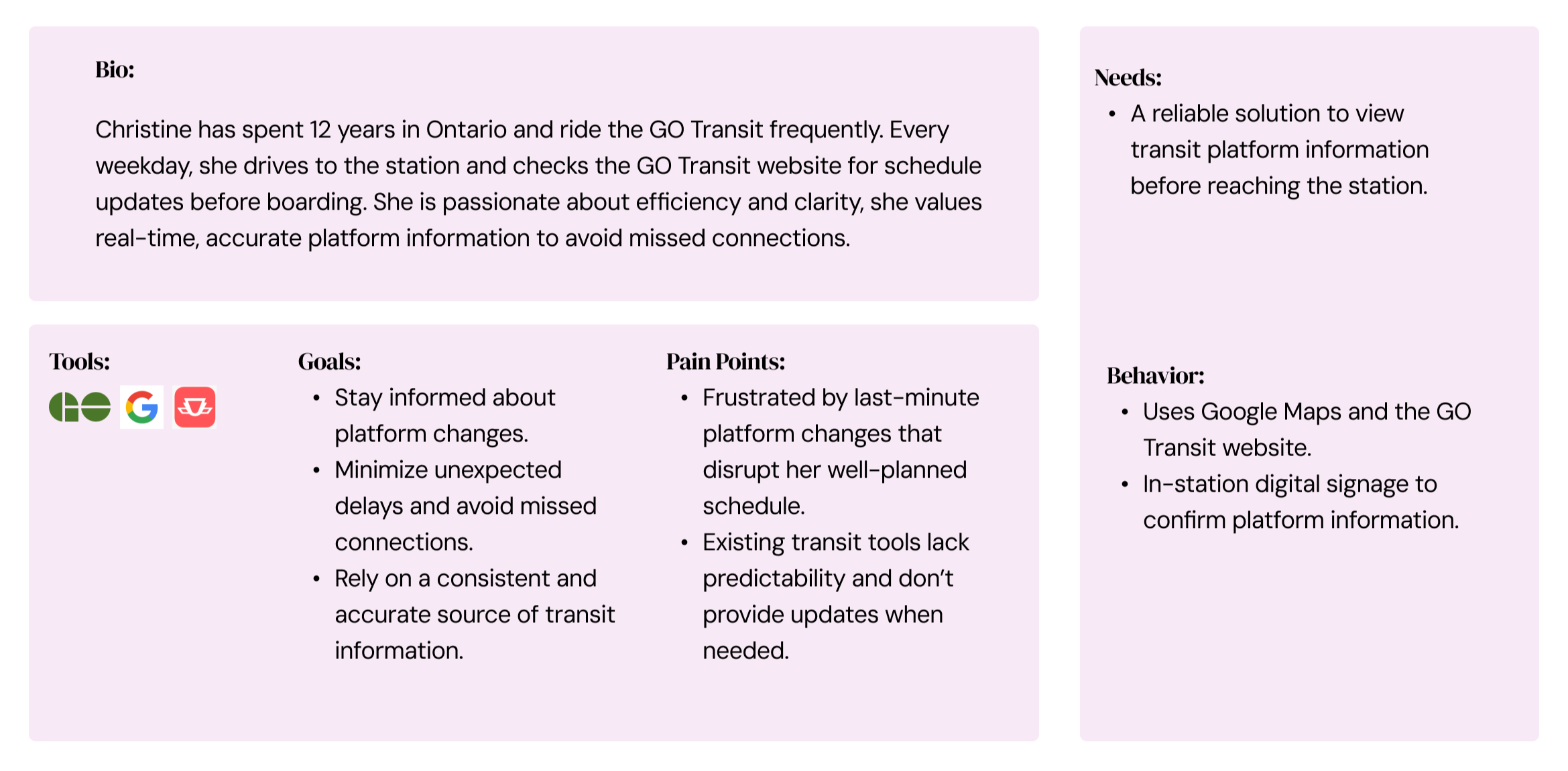
Persona
“Unexpected platform changes can derail my entire day, so reliable updates are an absolute must.”
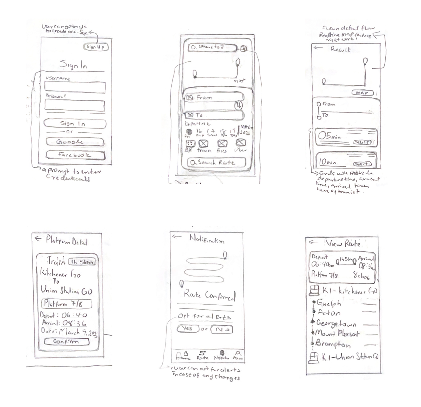
Sketches
Exploring before refining.
I sketched multiple concepts to test layout, hierarchy, and platform visibility. The green-highlighted sketches are the solution sketches.
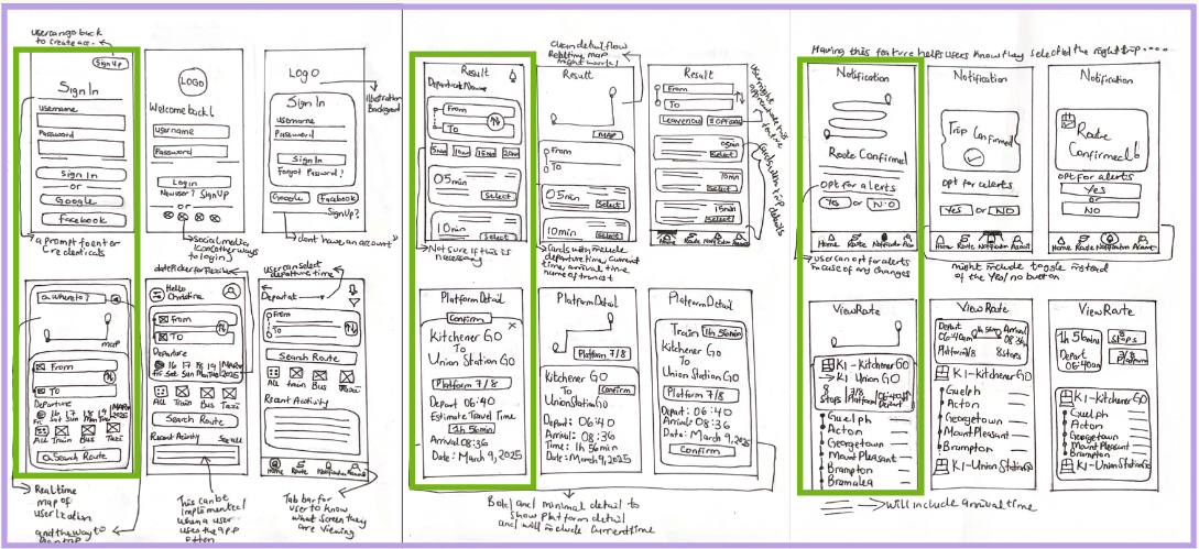
The direction that stuck.
With the solution sketches, I focused on one priority: make platform information impossible to miss; by prioritizing real-time visibility, clear route results, and proactive notifications.
Wireframe
Designed for Calm, Fast Decisions
If commuters could see platform changes before they reached the station, they could avoid the panic, the sprint, and the missed train; turning stress into clarity.

Usability Testing
From Feedback to Flow
I tested the wireframes with 5 commuters to validate clarity, spot friction points, and refine the experience into a smoother, more intuitive flow.
of participants were satisfied with overall experience.
100%
100%
of participants finished the task.
80%
of users accomplished the goal without any errors.
Iteration 1
Iteration 2
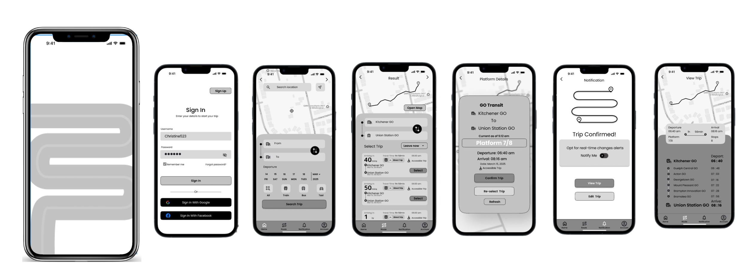
After several iterations based on the 5 testers feedback, I arrived at my final wireframe. With this ideation, I designed my high fidelity prototype.
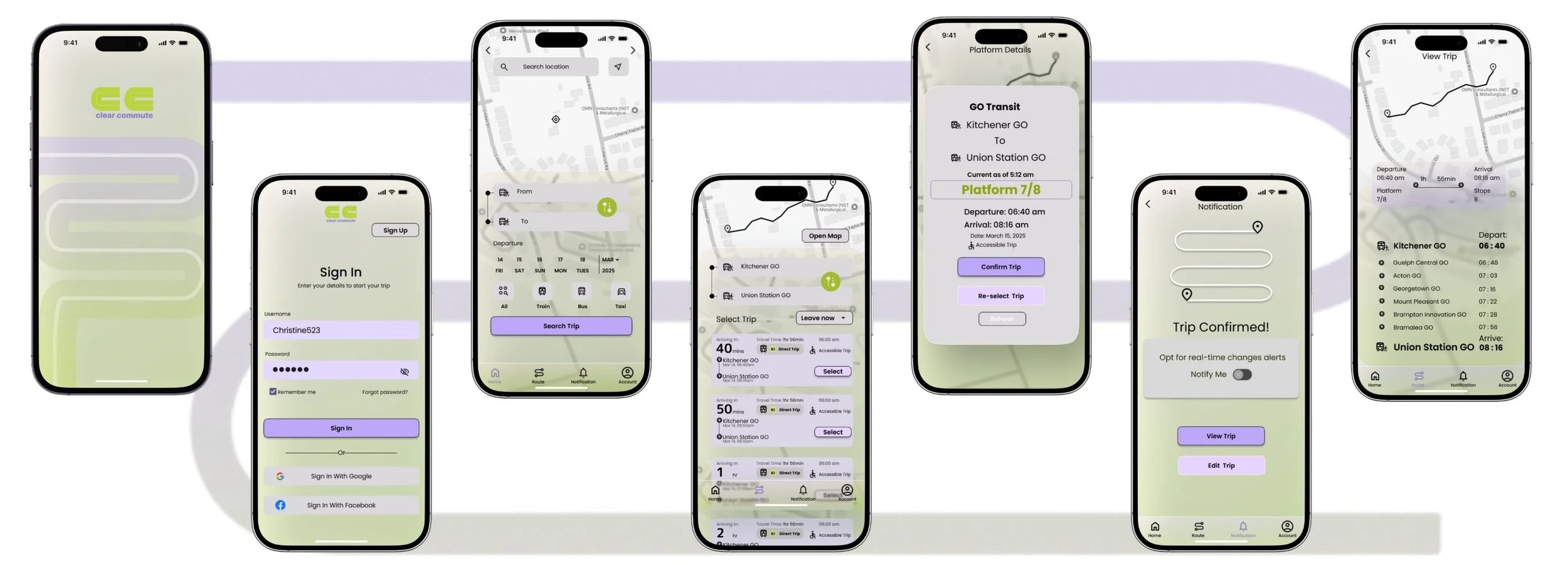
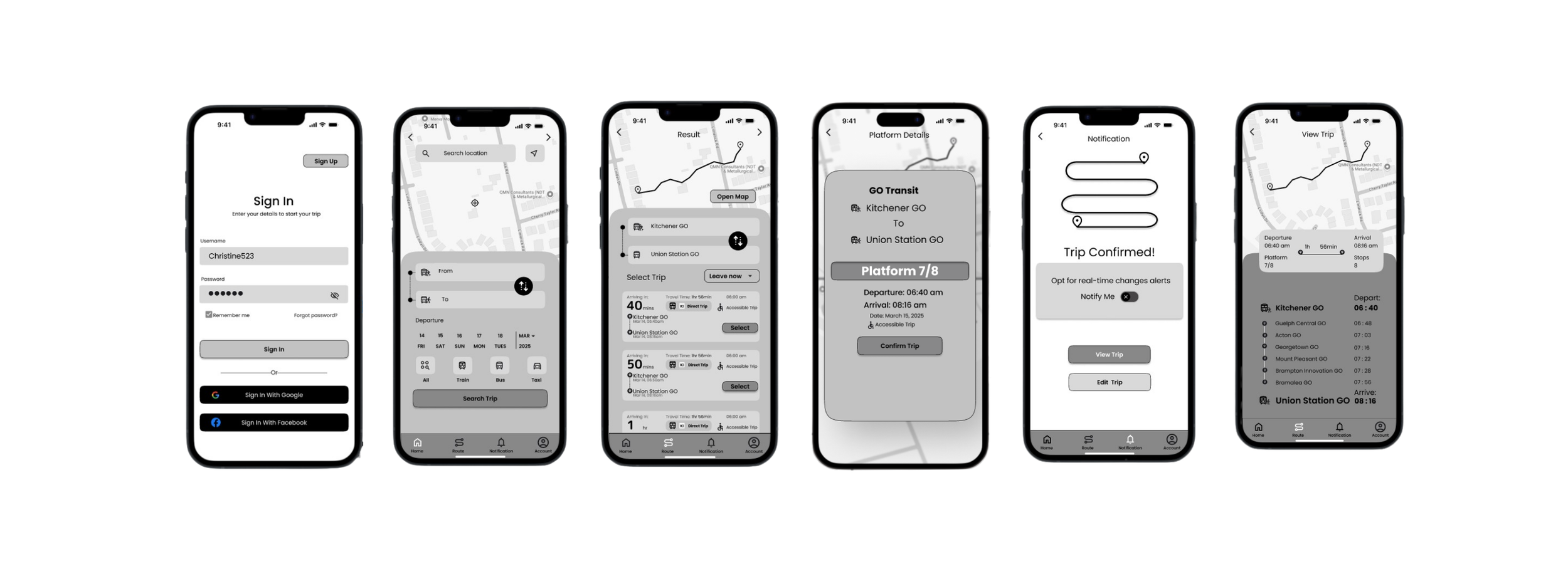
High Fidelity Prototype

After several iterations based on the colour injection and exploration, I arrived at my finial prototype that highlights my brand identity.
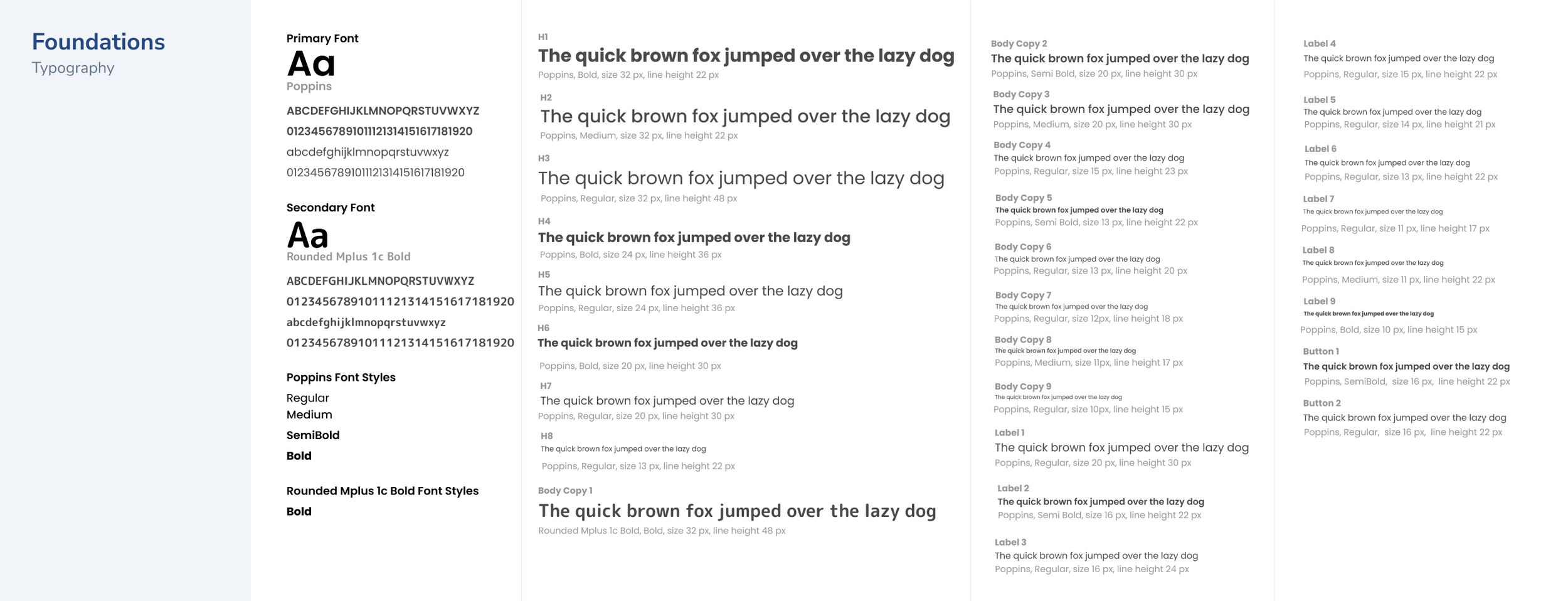
UI Library
Consistency, Built In
To keep ClearCommute consistent and scalable, I created a UI Library that defines key components, typography, and spacing—making the design easy to maintain and build on.
Foundation - Typography, Colour, Grid, Accessibility


Atoms - Icons, Buttons, Input and Control


Molecules, Organisms, & Template


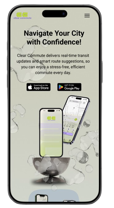
Marketing Website
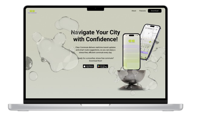
To introduce ClearCommute, I designed a responsive marketing website for desktop and mobile. Inspired by fluidity, I created a smooth, seamless experience that reflects the calm and clarity of the app.
Key Learnings
Empathizing with users needs has impacted my design thinking.
Organizing design process helps ensure seamless progress.
Feedback is very valuable at any stage of the design process.
Next Steps
Improve the app and add some extra features.
Test and gather feedback for improvement.
Handoff with developers.