Saving inspiration shouldn’t feel confusing.
Pinterest is built around one simple action: saving ideas you love.
During my heuristic evaluation of the Pinterest iOS app, I discovered that small usability gaps like unclear refresh gestures, hidden actions, and difficult error recovery; create friction in one of the platform’s most important flows: saving and organizing pins.
Using Nielsen’s usability heuristics, I evaluated the pin-saving experience and redesigned key interactions to improve clarity, control, and feedback, while maintaining Pinterest’s existing brand system.
Timeline:
2 weeks
Tools:
Figma, Figjam
Platform:
IOS
Roles:
User Researcher, UX/UI Designer, Usability Tester, Heuristic Evaluator
The Challenge
Pinterest’s interface is visually simple—but small interaction gaps can interrupt the user’s flow.
My goal was to evaluate how well Pinterest supports one of its most essential actions: saving and organizing inspiration.
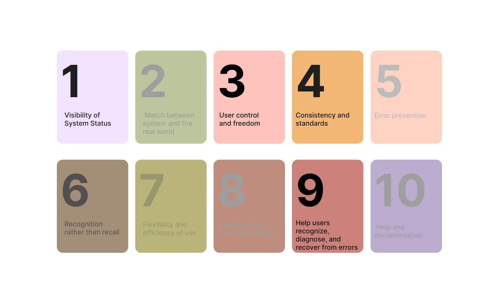
Using Nielsen’s 10 usability heuristics, I analyzed the pin-saving experience to uncover where the design breaks down—and how small improvements could make the experience clearer, faster, and more forgiving.
Why Pinterest?
Pinterest is one of the most visually intuitive apps on the internet.
But when an interface feels effortless, usability issues can be harder to notice. Because Pinterest relies heavily on the act of saving inspiration, even small usability gaps can create friction in the user experience.
This made it the perfect case study to explore how small design changes can create clearer, faster, and more forgiving interactions.
The Method
What is Heuristic Evaluation?
A heuristic evaluation is a usability inspection method where experts evaluate an interface against recognized usability principles.
Instead of testing with users, designers analyze the interface using Nielsen’s 10 usability heuristics to identify where the product may break usability best practices.
This approach helps uncover usability issues early and highlights opportunities for improvement.

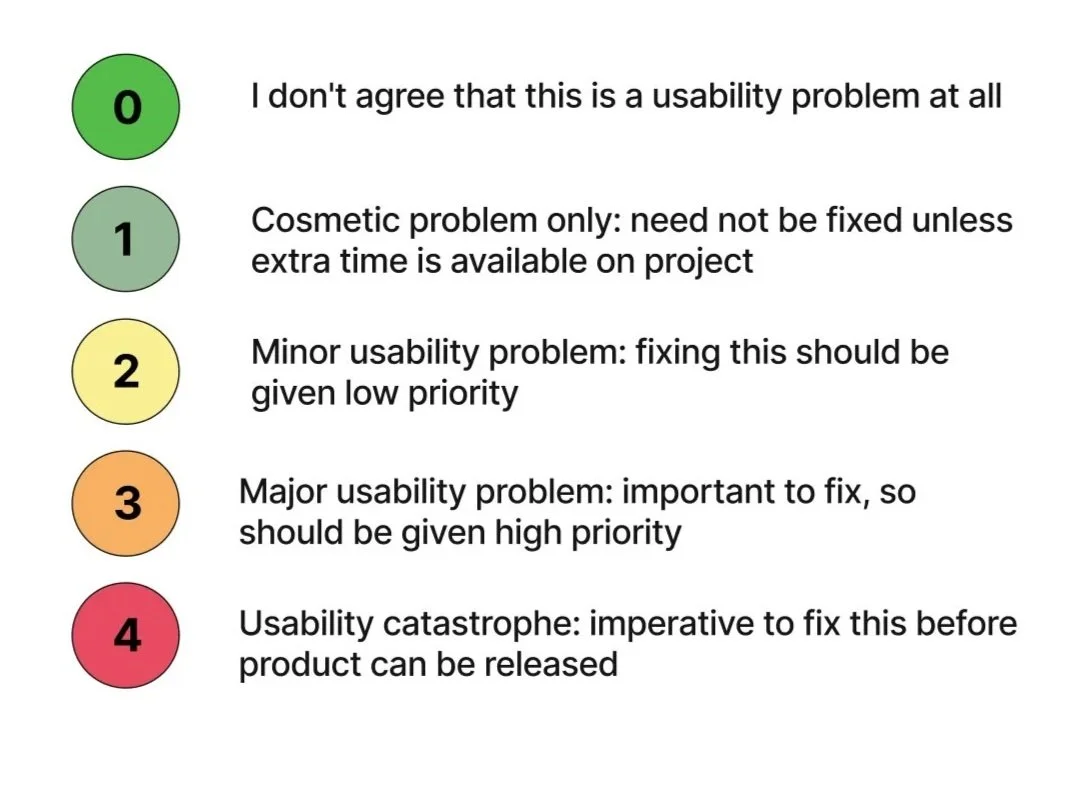
Heuristic Rating System
I developed a severity legend made up of a 5 point rating system to see how well Pinterest’s app meet each principle evaluation.
Heuristic Selection
Constraints
Designing Within Constraints
Because Pinterest has a strong brand identity, redesigns needed to respect the existing system.
All improvements were designed using:
• Pinterest’s brand color palette
• Similar typography styles
• Familiar interaction patterns

The goal was not to reinvent the interface, but to improve usability without disrupting the product experience.
User Flow
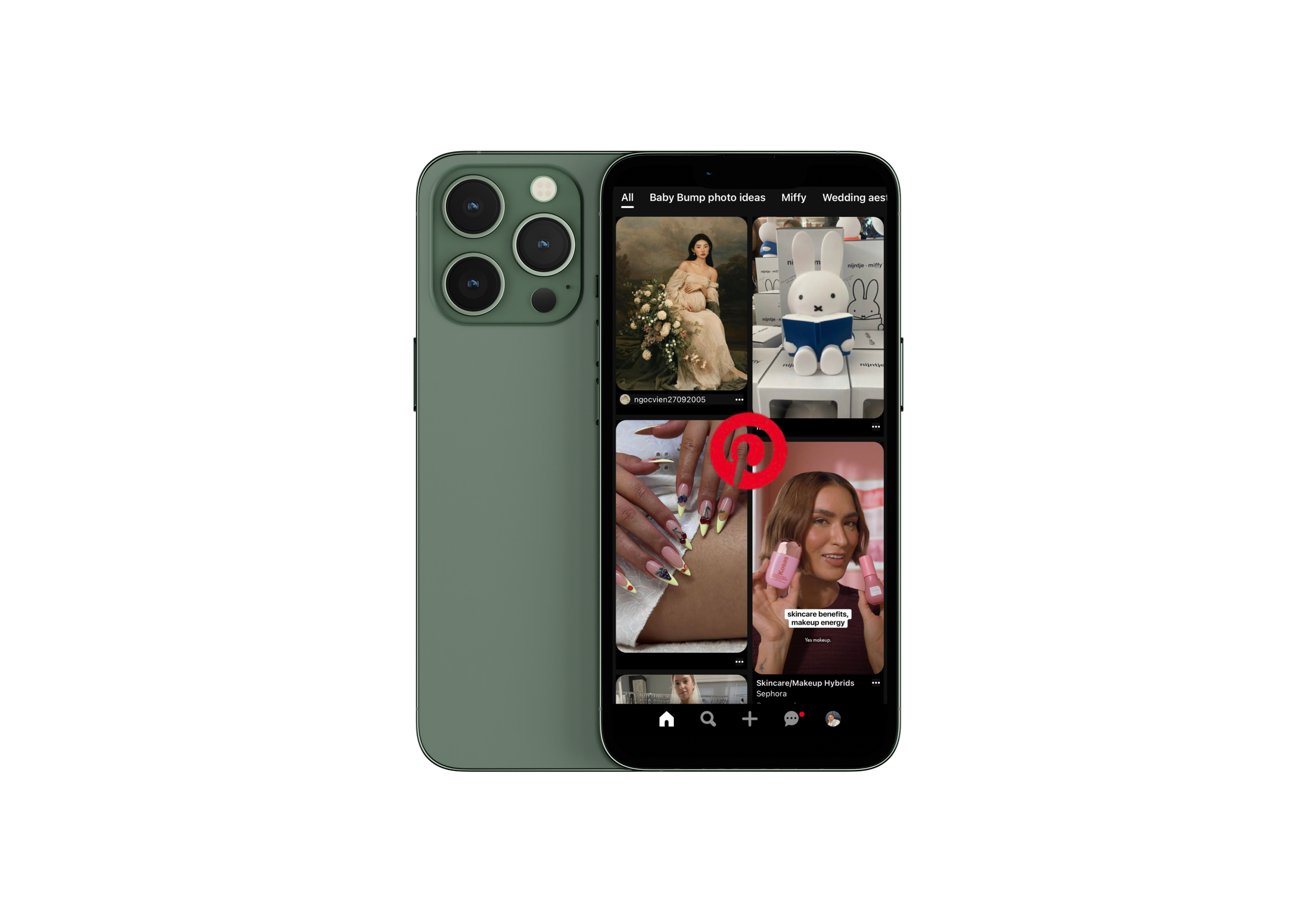
Saving and organizing a pin
The main task that was chosen for the evaluation was to save and organize a pin. The task flow for saving a pin involves selecting an image, choosing a board or folder to save it in, and confirming the saved action.

Evaluation & Redesign
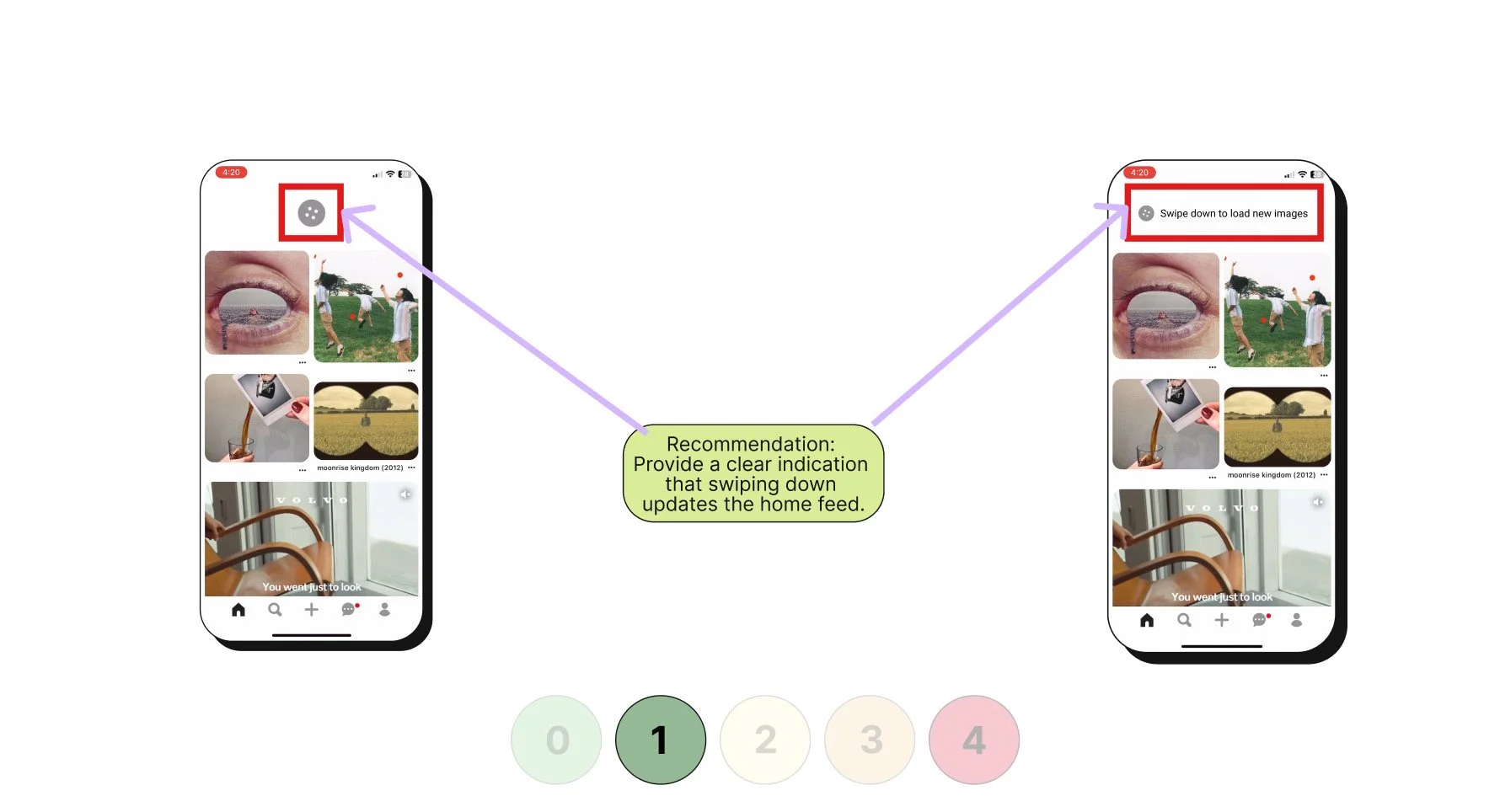
Visibility of System Status
During the evaluation, I noticed that the loading icon at the top refreshed the home feed with a new set of images. However, this action was not communicated clearly to users, leaving them unaware of what was happening when the refresh occurred.
Redesign Solution:
To address this, I introduced a clear indicator showing that swiping down updates the home feed. This design provides immediate feedback and sets user expectations by making the system’s response visible, ensuring users understand both the action they are taking and its outcome.
Original Design
Redesign
For the severity rating I gave it a 1 - Cosmetic problem only: need not be fixed unless extra time is available on project
User Control & Freedom
When evaluating this principle, I observed that after saving (pinning) an image to a board, users do not have an easy way to undo the action. If a pin is saved by mistake, the only option is to navigate into their collection and manually delete it. This creates friction and reduces the user’s sense of control.
Redesign Solution:
To improve this experience, I proposed adding an “Undo” button that appears immediately after saving a pin. This temporary action would allow users to reverse the save instantly without leaving their current context. In addition, I suggested toggling the “Save” button into a “Saved” state with an option to remove the pin directly, giving users more flexibility and freedom to correct mistakes quickly.
Original Design
Redesign
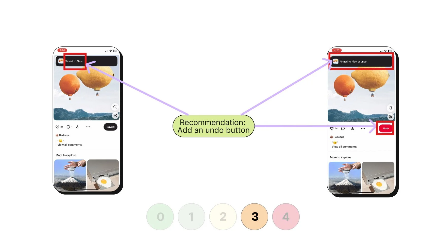
For the severity rating I gave it a 3 - Major usability problem: important to fix, so should be given high priority
User Control & Freedom
While reviewing the folder (board) view, I noticed that when a pin is mistakenly saved, the meatball menu on the folder screen does not allow users to delete that image directly. This forces users to take additional steps outside of the immediate context, reducing efficiency and control over their content.
Redesign Solution:
To address this, I proposed expanding the meatball menu to include a “Delete Pin” option directly within the folder view. This change gives users a quick, contextual way to remove mis-saved pins without navigating elsewhere, streamlining the workflow and reinforcing a sense of freedom and control.
Original Design
Redesign
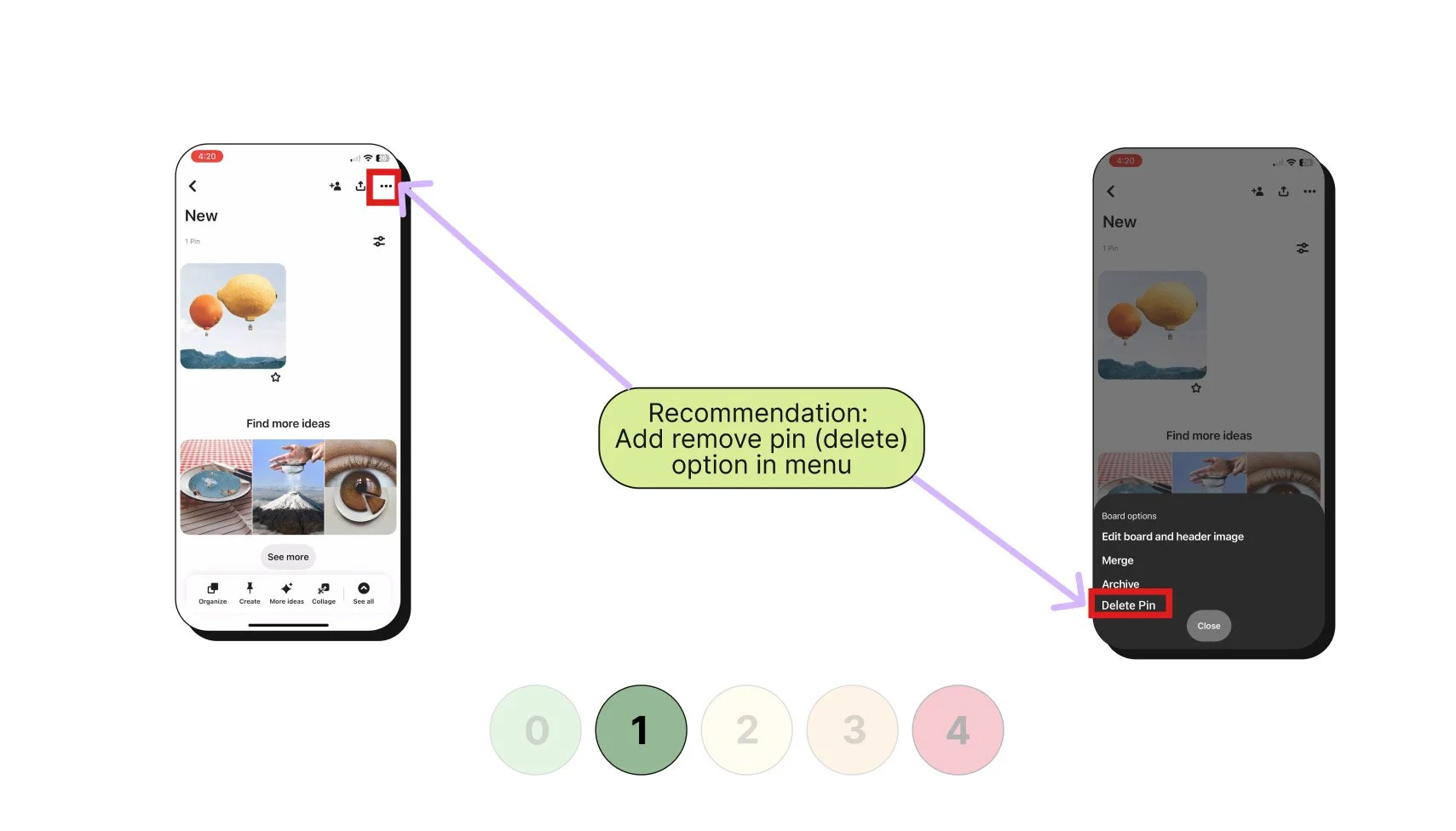
For the severity rating I gave it a 1 - Cosmetic problem only: need not be fixed unless extra time is available on project
Consistency & Standards
During the evaluation, I observed that the app uses the term “Save” instead of “Pin.” This inconsistency may confuse users who are accustomed to the concept of pinning items to boards, which is central to Pinterest’s brand identity. The use of differing terminology creates a small but notable disconnect in the user experience.
Redesign Solution:
To maintain consistency and align with user expectations, I recommended standardizing the terminology across the app by using “Pin” rather than “Save.” If both terms must be used for technical or marketing reasons, clear onboarding or tooltips should explain that the two actions mean the same thing. This change strengthens brand alignment, reduces user confusion, and improves overall clarity in navigation.
Original Design
Redesign
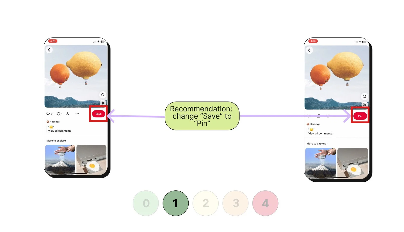
For the severity rating I gave it a 1 - Cosmetic problem only: need not be fixed unless extra time is available on project
Help Users Recognize, Diagnose, and Recover from Errors
I observed that when a user mistakenly saves a pin to the wrong folder, the app does not provide any guidance or solutions to correct the error. Users must manually locate the pin, remove it, and then re-save it to the correct folder, which is time-consuming and frustrating.
Redesign Solution:
To improve error recovery, I proposed adding a contextual prompt that appears when a pin is saved. For example, if the system detects the pin may not belong in the selected folder or if the user realizes the mistake immediately, a notification could offer options such as “Move to another board” or “Undo.” This proactive design helps users quickly recover from errors, reduces frustration, and creates a smoother, more forgiving experience.
Original Design
Redesign
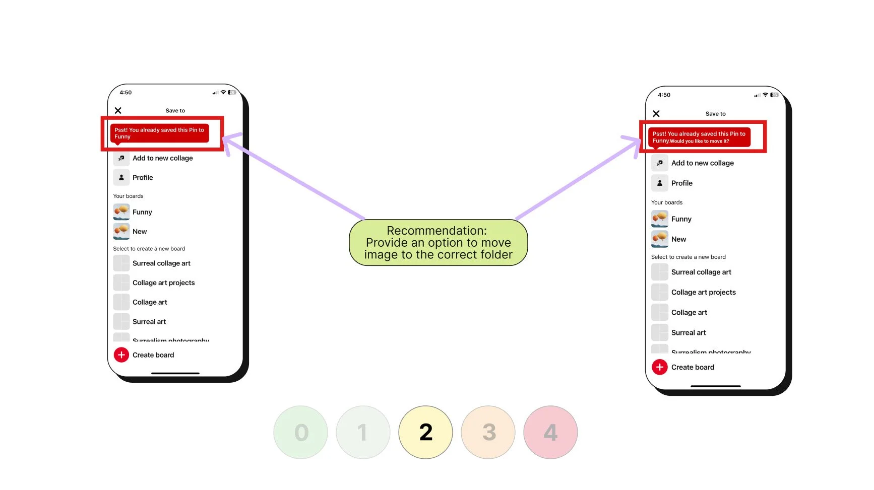
For the severity rating I gave it a 2 - Minor usability problem: fixing this should be given low priority
Key Learnings
Adhering to the brand’s established constraints is critical.
Redesigning the existing solution rather than completely recreating it.
Next Steps
Implement the redesigned changes into interactive prototypes to bring the solution to life.
Conduct comprehensive testing of the implemented changes to validate improvements and gather user feedback.