Clear Commute
My Roles: User Researcher, UX/UI Designer, Branding, Marketing
Tools : Figma, Figjam, Canva, Miro, Slack, Otter.AI
Developed a transit app that gives Ontario commuters real-time platform updates, because catching your train or bus shouldn’t feel like a guessing game. Clear Commute ensures you always know where to go before you even reach the platform.
Time: 10 weeks
Platform: IOS
Project
Background
Identifying the Problem
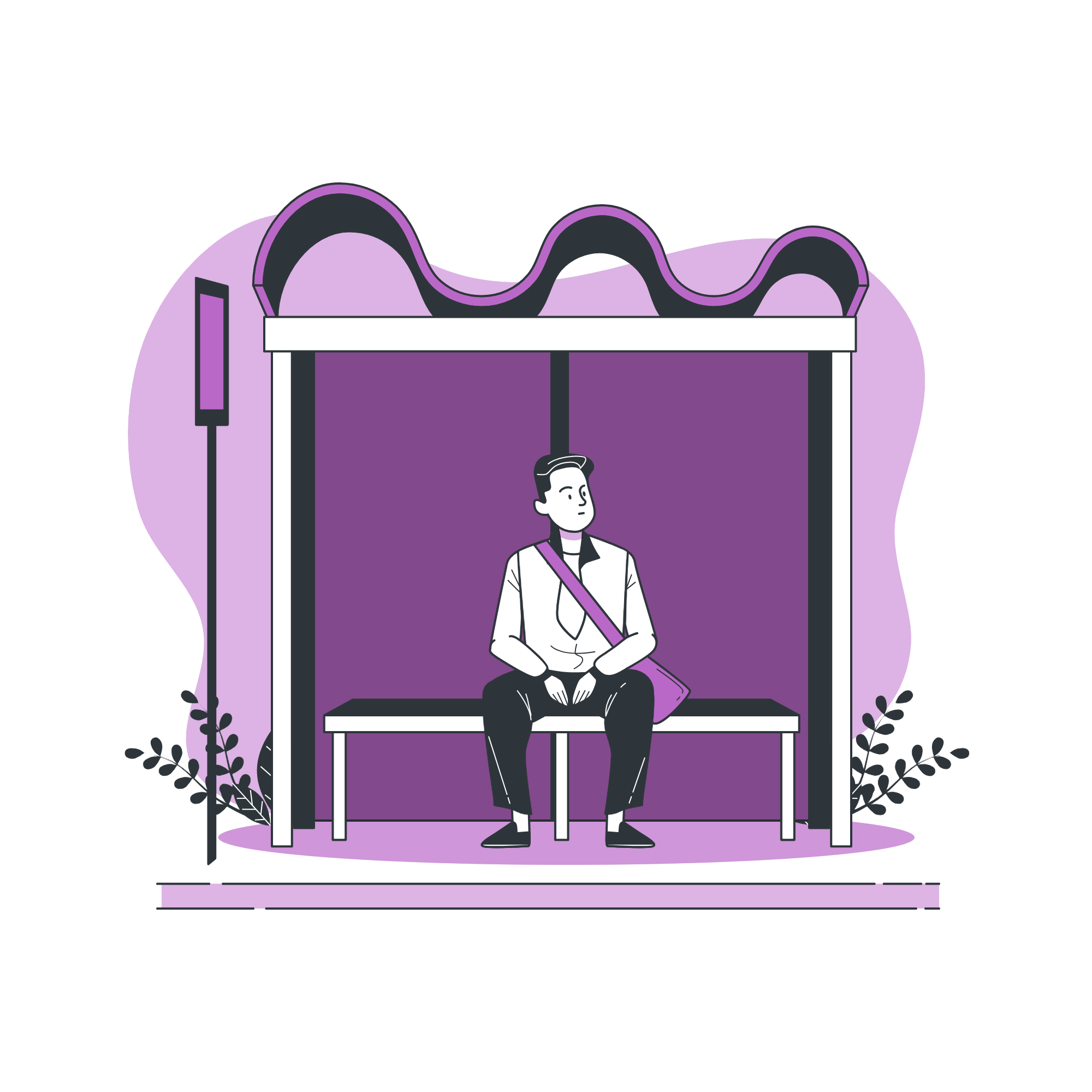
For many Ontario professionals, public transit is essential, but it’s far from seamless. Imagine rushing to the station, only to find your train’s platform has changed at the last minute. You scramble for answers, but confusion costs you precious time, and just like that, the doors close without you. Sound familiar?
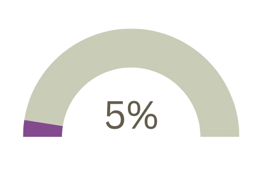
This is the daily reality for thousands of working adult commuters (ages 22-55) who rely on public transit in Ontario. They often face uncertainty about which platform their train or bus will depart from. With 5% of platform changes occurring unexpectedly, impacting over 15,000 passengers daily, there is a clear need for a real-time platform information solution. This would help passengers avoid missed connections and reduce travel delays.
Research Goals
To design a truly user-centered solution, I focused on understanding the core challenges and frustrations of public transit riders when it comes to platform changes. By analyzing the gaps in existing tools like GO Tracker, TTC app, and other transit apps, I set out to discover how commuters want to receive real-time updates and what key features a mobile app must have to make their transit experience smoother and stress-free.
Method
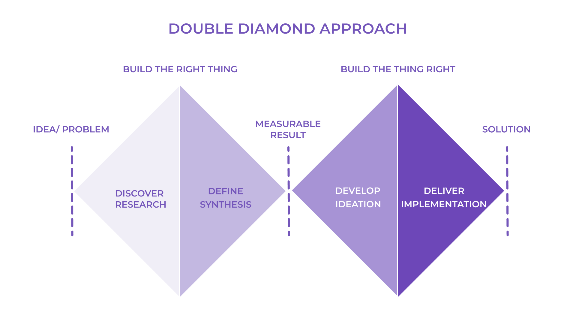
Great design starts with exploration. Following the Double Diamond Design Methodology, I embraced both expansive thinking (divergent) and focused problem-solving (convergent). This method allowed me to explore bold ideas before honing in on the most effective solution. This structured guided me through four key stages, ensuring that every decision was intentional and user-centered.
Discover
Research
Key Insights
Define
Persona
User Stories
Task Selection
Develop
Sketching
Wireframes & Prototype
User Testing
Deliver
Visual Identity
Marketing
Next Steps
Discover
Secondary Research
To further understand the issue, I reviewed several key secondary sources and identified the following insights:
5% of commuters are affected by unexpected or last-minute platform changes, this would translate to more than 15,000 daily riders experiencing delays or missed connections.
Some public transit platform information is typically announced only 10 to 15 minutes before departure.
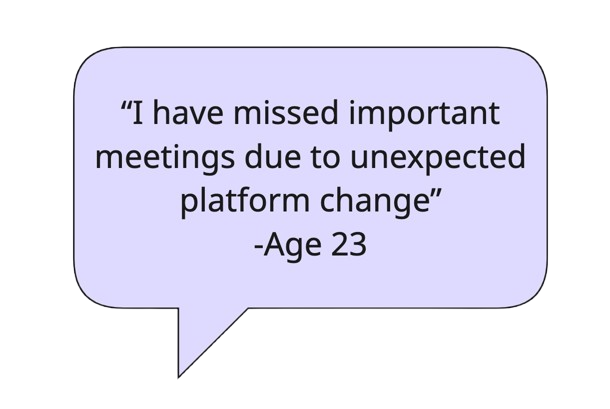
Others don’t update commuters about platform changes, which leads to scrambles, missed meetings and longer travel times.
My secondary research painted a clear picture. Commuters aren’t just looking for convenience, they’re searching for certainty. The unpredictability of platform changes and the lack of real-time updates leave thousands scrambling daily. Every missed connection means lost time, added stress, and disrupted routines.
There’s a clear need for a solution that delivers accurate, real-time platform data that gives commuters the confidence to navigate their journeys without second-guessing.
Which led me to ask
How Might We…….
deliver optimized, real-time platform information to working-adults (ages 22-55) public transit commuters to help them avoid missed connections and reduce travel stress?
But to truly understand the daily struggles of commuters, I needed to go beyond data, I needed to hear their stories. That’s where my primary research began.
Pain Point
Primary Research
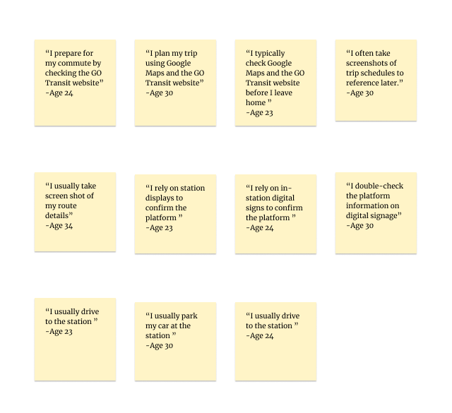
To make sense of my research, I turned to affinity mapping, transforming a sea of quotes and observations into clear, actionable insights. By grouping recurring pain points, behaviors, and goals, I uncovered the patterns that define commuters' challenges; bringing their daily experiences into focus and paving the way for a truly user-centered solution.
Interviews : What are people saying about the issue ?
Motivation
Behaviour
-
Conduct 20 mins interview with 17 questions to commuters who frequently use public transit as a means of transportation.
Interviews will be conducted remotely via video call and in-person.
-
Demographics: Working adults (ages 22-55) in Ontario who use public transit at least three times per week.
Participants should be comfortable using smartphones
Participants should have experienced at least one unexpected platform change.
-
Warm-Up Questions:
What is your age?
What is your occupation?
How long have you lived in the Ontario?
When was the last time you took the public transit?
Can you walk me through a typical day when you used the public transit e.g GO Transit or TTC?
Problem Space Specific Open-Ended Questions:
Can you describe any challenges you’ve encountered when trying to access real-time platform information before arriving at the station?
How do unexpected platform changes affect your commute, and can you share an example of a particularly frustrating experience?
What aspects of the current method for checking platform information (e.g., using the GO Tracker website TTC app or platform signage) do you find most inconvenient?
How do delays or confusion over platform information impact your overall travel experience or schedule?
In what ways has the uncertainty around platform details led to missed connections or additional stress during your commute?
What motivates you to use public transit over other transportation options like Uber, despite these challenges?
How important is having accurate, real-time platform information to you when planning your commute?
What benefits would you expect from the next solution that provides up-to-date platform information?
How would reliable platform data influence your overall satisfaction with public transit?
What features or improvements in accessing transit information would make you feel more confident about your daily travel plans?
Can you walk me through how you currently check for platform information before starting your journey?
Which tools or apps (if any) do you use to plan your trips, and what do you like or dislike about them?
How do you typically respond if you learn about a platform change while you’re already on your way to the station?
How often do you rely on in-station announcements or digital signs for platform information compared to checking it online in advance?
Have you developed any personal strategies or workarounds to cope with last-minute platform changes, and if so, what are they?
-
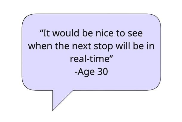
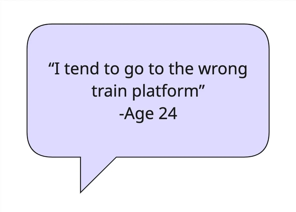
Commuters expressed frustration over not having access to platform details during their travel.
Commuters described issues with the clarity and reliability of platform information provided at stations, such as tiny or malfunctioning displays.
Commuters want to have a timely and reliable platform data to reduce last-minute scrambles and prevent missed connections.
As I listened to commuters’ experiences, a clear pattern emerged and one frustration united them all. The lack of real-time platform information before reaching their platform was the biggest challenge, causing uncertainty and missed connections. This insight became the driving force behind my design decisions, shaping the central theme: Optimized, Real-Time Information.
Define
Persona
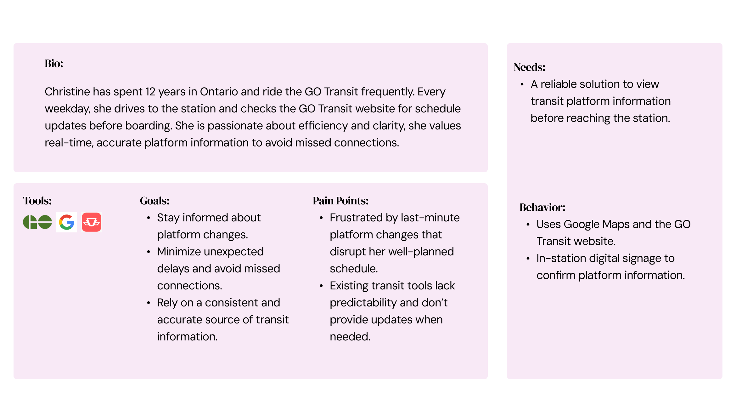
To truly step into the shoes of my users, I created a persona grounded in real voices and everyday frustrations. Meet Christine James; a reflection of the busy, organized professional navigating Ontario’s transit system.
Christine represents the core needs and behaviours of my target commuters, brought to life through insights drawn from in-depth interviews and secondary research. Her story helped me humanize the data and guide design decisions with empathy and clarity.
“Unexpected platform changes can derail my entire day, so reliable updates are an absolute must.”
Opportunity for Design
With a clear understanding of Christine’s frustrations, it became evident that a design opportunity was essential. By stepping into her shoes, I crafted a comprehensive set of user stories to ensure every design decision directly addressed her daily challenges, making her transit experience smoother and more reliable.
User Stories
-
I want to see live updates on delays and estimated arrival times so that I can adjust my schedule accordingly.
I want to check platform details for my route in advance so that I know when my means of transportation arrives.
I want to set alerts for specific routes and stations so that I receive relevant information without having to check manually.
I want to view real-time crowd levels on platforms so that I can plan for a less congested experience.
I want to access platform data from multiple transit agencies in one place so that I don’t have to switch between different sources.
I want to receive alternative travel suggestions when my platform changes last-minute so that I can avoid unnecessary delays.
I want to save my frequently used routes so that I can quickly check platform updates without searching every time.
I want to view a timestamp on real-time updates so that I can verify the information is current.
I want to used a voice alert feature that reads out platform changes so that I can stay informed without looking at my phone.
I want to see historical data on platform changes for my regular routes so that I can plan better around typical delays.
I want to customize the frequency and timing of notifications so that I receive only the most relevant updates without being overwhelmed.
I want clear visual indicators (such as color coding) for platform status so that I can quickly assess if there are any issues.
I want a daily summary of transit updates in the morning so that I can plan my commute for the entire day.
I want the app to provide alternative route suggestions when unexpected platform changes occur so that I have backup options readily available.
Selected User Story
As a Commuter, I want to…….
check platform details for my route in advance so that I know when my means of transportation arrives.
Core Epic
Task Selection
To shape the core functionality of my design solution, I turned to Agile Methodology, using User Stories as the foundation for identifying key Themes.
From there, I distilled the most impactful insights into a Core Epic “Real-time Platform Updates” by directly tackling the biggest pain point of my persona, Christine.
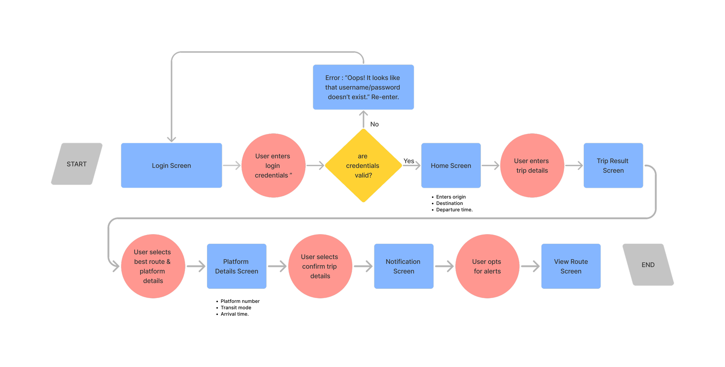
Task Flow
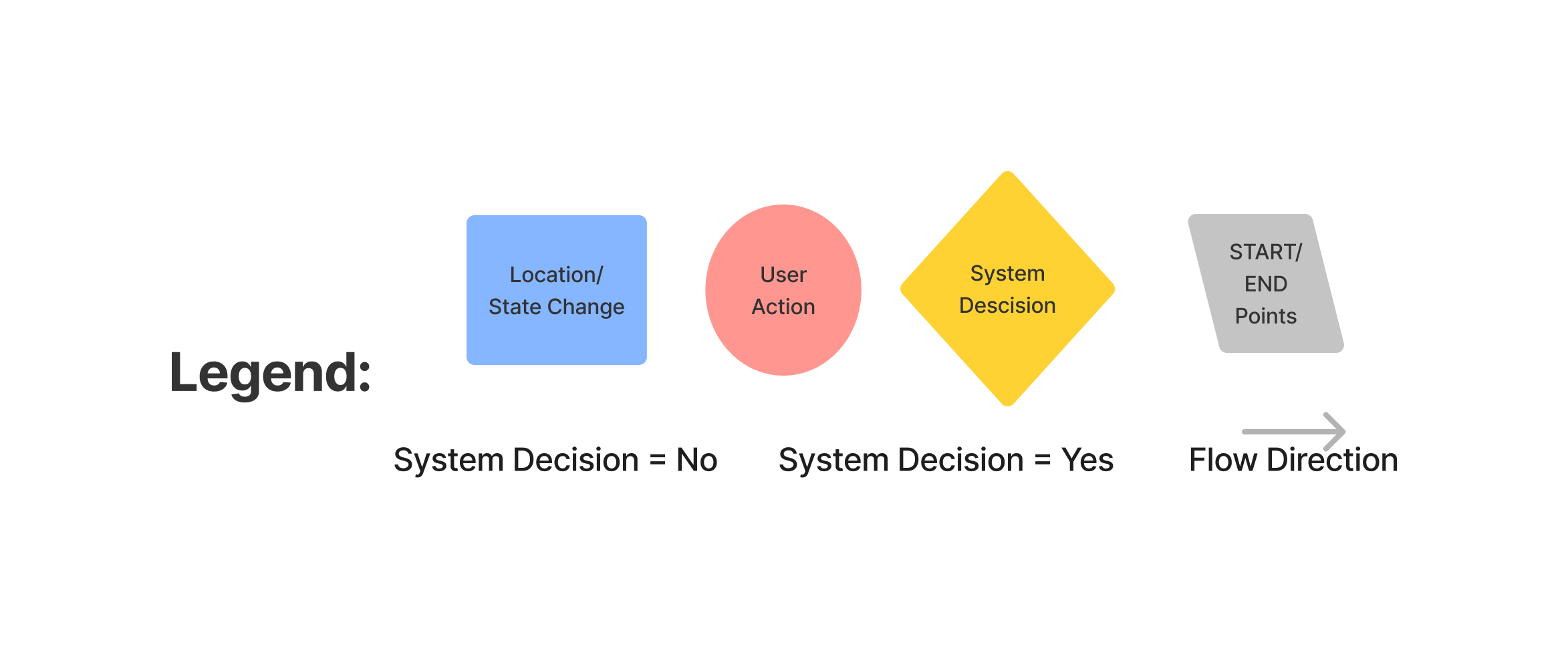
To design a real-time transit information for users like my persona, Christine, I first had to create a task flow of the screens and features Christine would encounter.
Key Task: The key user task is to check platform details for their route in advance.
Key User Story: As a commuter, I want to check platform details for my route in advance so that I know when my means of transportation arrives.
Develop
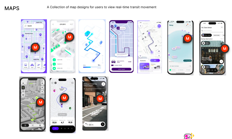
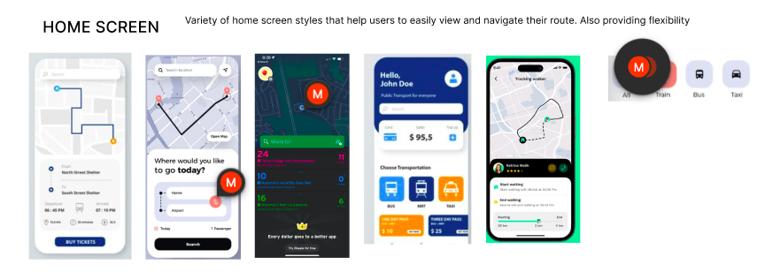
To bring Christine’s journey to life, I began by crafting a UI inspiration board collecting visual elements from existing mobile apps that align with her need for clarity, ease, and real-time support. This board became a visual compass, guiding me through Christine’s priorities and the emotional tone of the experience.
From there, I explored multiple sketching directions, allowing ideas to take shape around her goals. After testing out several concepts, I narrowed it down to the most promising solution sketch that directly supports her needs and seamlessly aligns with the task flow.
User Interface Inspiration Board
Sketches
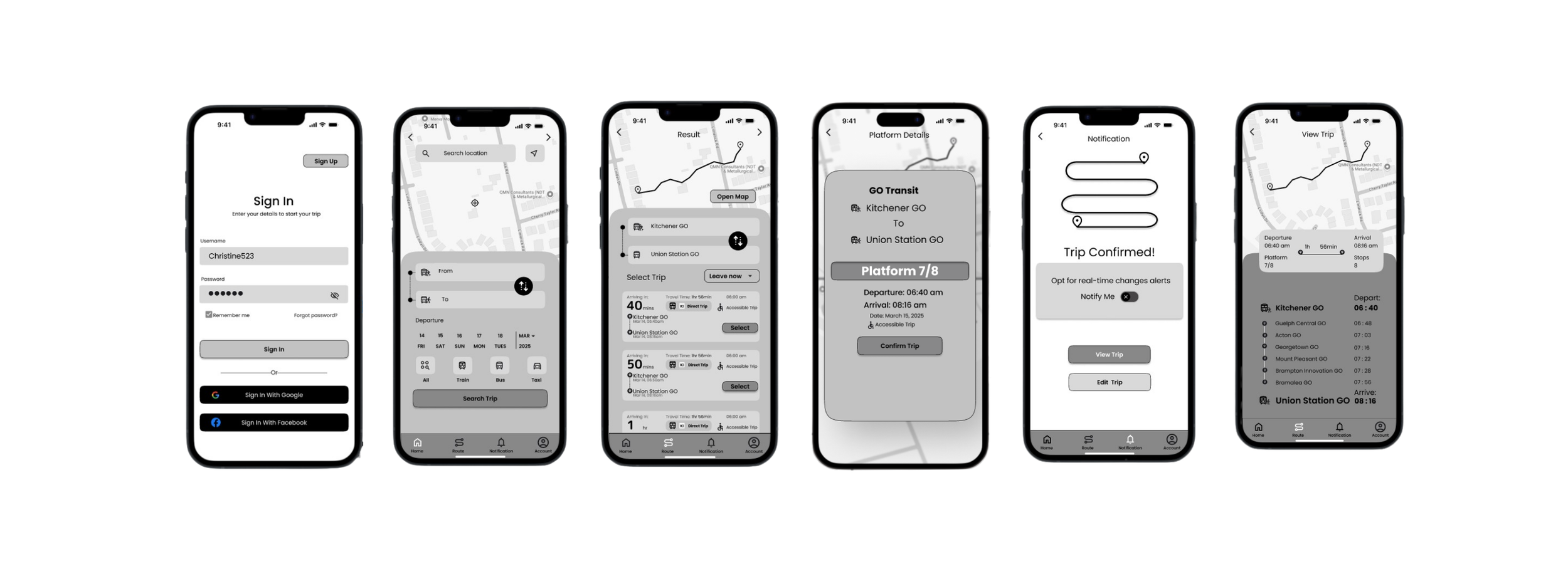
With Christine’s needs as my guide, I brought the solution sketch (highlighted in green) to life through a grayscale wireframe, laying the foundation for a seamless and intuitive experience. I stripped away from colour; which allowed me to focus on structure and flow, making sure every screen spoke clearly, without distraction.
Low Fidelity Wireframe Version 1
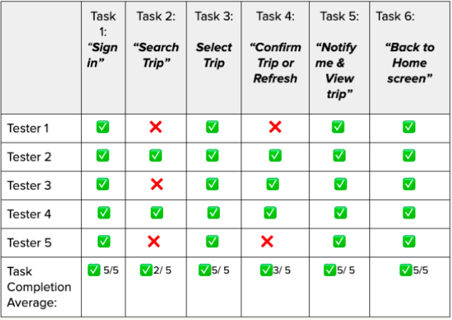
To ensure the design was both clear and consistent, I put my wireframes to the test. I created a structured usability testing plan and invited five participants to complete five realistic tasks using the prototype.
Usability Testing Result Version 1
Watching them interact with the app in real time revealed what worked, what didn’t, and where users hesitated. The feedback became the fuel for thoughtful iterations, helping me refine Clear Commute into a smoother, more intuitive experience.
-
Task 1 - Account Sign in “ select sign in”
Task 2 - locate where you can search for your route on the home screen and select date and mode of transportation.
Task 3 - Trip Result “select trip that works for your timeline and view platform details”
Task 4 - Platform details “ confirm trip and also refresh page
Task 5 - Notification “ opt for alert and view trip details
Task 6 - View Trip “ click on the home screen to go back after viewing trip.
-
Check for platform details in advance and opt for notification.
-
One Overarching Scenario
You are commuting to work and want to check the platform details for your trip in advance. Use the app to search for your route, find platform details, and confirm your trip. After confirming, ensure that you receive platform update notifications.”
-
The screen section displaying trip duration needs redesign for better clarity.
Images of the platform on the platform details screen to help them visually identify it before arriving.
Minor inconsistencies in layout and navigation were noted, suggesting the need for enhanced visual hierarchy and consistency.
Prioritization Matrix
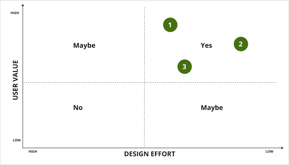
Based on the feedback from the testers, I plotted the issue that arose on the design prioritization matrix based on what would provide the highest user value relative to the design effort.
Make home screen Input interactive
Use simple text for platform number
Remove shadow on refresh button
Add photo of platform
Change font colour for smaller text in cards e.g result screen
Replace Uber to taxi
Fix spacing in buttons and font size
Low Fidelity Wireframe Version 2
For the second round of testing, I created a structured usability testing plan and invited a different set of five participants to complete five realistic tasks using the prototype.
Usability Testing Result Version 2
Overall, testers were enthusiastic about the app, expressing that they would most likely use it. They particularly appreciated the innovative features, such as the integrated maps, real-time clock display, and clear presentation of different stops and estimated arrival times.
-
The “Platform 7/8” element still appear clickable.
Some screens (e.g., “Trip Confirmed,” “View Trip”) lack a clear way to go back or switch routes quickly.
make all primary and secondary buttons the same
Prioritization Matrix Version 2
Based on the feedback from the testers, I plotted the issue that arose on the design prioritization matrix based on what would provide the highest user value relative to the design effort.
Implement a consistent back button or a bottom navigation bar.
Remove button-like styling, use a simple text label or card-like container.
Resize primary and secondary button by making the a component.
Low Fidelity Wireframe Version 3
After several iterations based on the testers feedback, I arrived at my final wireframe. With this ideation, I will design my high fidelity wireframe through my brand development.
Deliver
Brand Development
Brand Adjectives
Once my revised prototype was finalized, I created a list of adjectives to represent my app and selected the ones that resonated most.
More A less B list
Based on my chosen adjectives, I expanded those words into a “More A less B list” to further define and solidify my brand identity.
More A
Futuristic
Sleek
Transparent
Minimalist
Dynamic
Streamlined
Serene
Fluid
Less B
Urban
Busy
Opaque
Cluttered
Static
Hectic
Rigid
Cumbersome
Mood Board & Colour
I then went ahead to create a mood board by combining different images that relates to the adjectives that I selected.
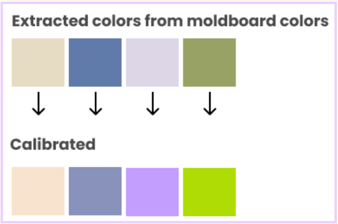
Next, I refined my mood board based on the images that best captured the desired feel of my app. After finalizing my mood board, I began extracting colours from all the images. Then I select some colours to calibrate, because I needed the colours to feel more harmonious.
-
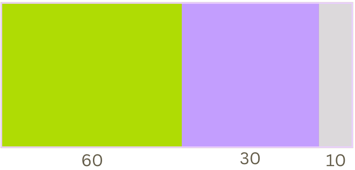
To achieve a 60-30-10 colour method, I began to explore colour combinations. I wanted two pops of colour and neutral.
The Primary brand colour would be a yellow-green that evokes a sleek and dynamic vibe that represents a futuristic style and liveliness. For the secondary colour, lavender adds a serene yet refined touch balancing the vibrancy of the primary hue. lastly, the neutral gray delivers a fluid, streamlined backdrop for clarity and readability.
Brand Name
Next, I started to brainstorm some brand names that will resonate with my brand identity and narrowed it down to three.
ClearRoute
ClearRoute
Pronoia
BrightPath
ClearCommute
conveys clarity and reliability. An intuitive name, making it easy for commuters to understand my app’s purpose at a glance.
TransitNow
K Transit
SmartPath
I chose these three brand names because they conveys clarity and reliability, suggesting that users will receive a clear, direct route for their transit journey.
K Transit
short, catchy, and memorable. The letter “K” evoke a sense of modernity and simplicity. It also feels like it is associated with a specific region (like Kitchener) rather than a broader Ontario transit solution.
ClearCommute
evoke clarity, simplicity, and reliability. It suggests that commuters can expect a clear, straightforward journey with no surprises, making it a strong fit for my app's purpose.
Finally, I decided on a brand name “ClearCommute” due to the fact that it evokes all positive qualities that align with a transit solution focused on delivering accurate, real-time information.
Word Mark Development
To create my word mark for the app, I started experimenting with different text font and free hand sketches to get the ideal style and line weights. I also vectorize for different logo iterations
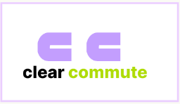
I finally came up with a sleek and streamline word mark and logo focusing on the two “c”. I also created some Iteration with the primary and accent colour. I wanted a word mark that convey to the vision of my app.
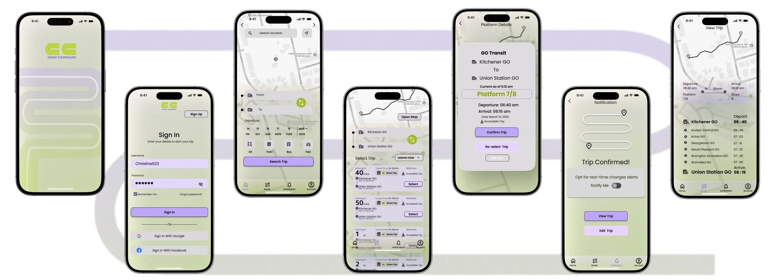
High Fidelity Prototype
After several iterations based on the colour injection and exploration, I arrived at my finial prototype that highlights my brand identity.
UI Library
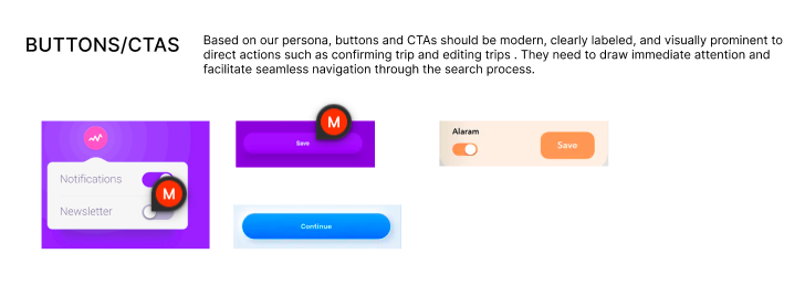
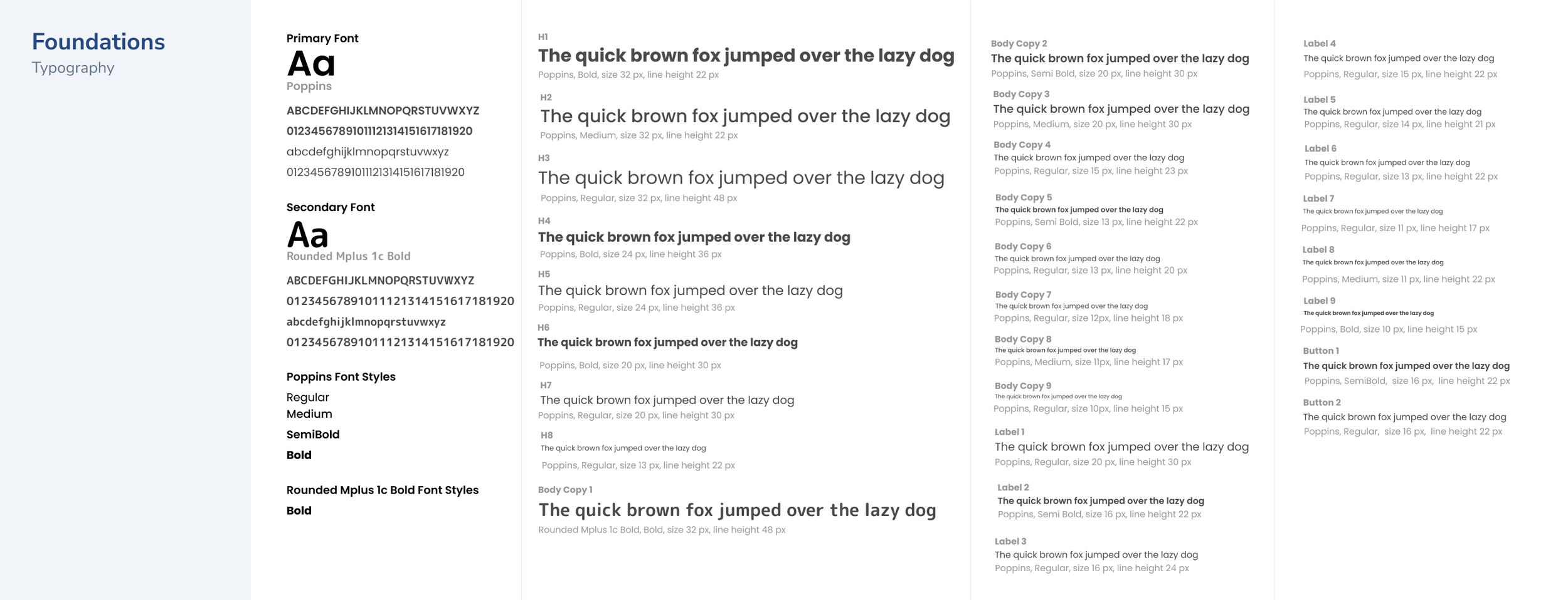
To keep ClearCommute’s design consistent and scalable, I built a UI Library that captured every visual detail from button styles to spacing rules. It will become a go-to guide not just for me, but for any designer who might revisit or build upon the product in the future.
Foundation - Typography, Colour, Grid, Accessibility
Atoms - Icons, Buttons, Input and Control
Molecules, Organisms, & Template
Marketing Website
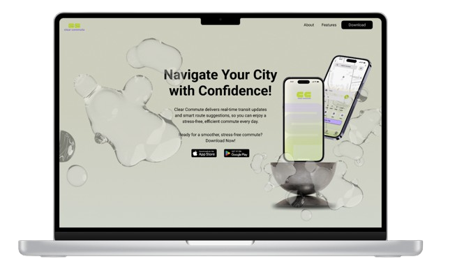
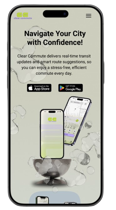
To craft the very first impression of ClearCommute, I designed a responsive marketing website for both desktop and mobile. Inspired by one of the key adjective of my app “fluidity,” I focused on creating a seamless, flowing experience that mirrors the ease and clarity users can expect from the product itself.
Future Thinking
As cities continue to grow and public transit becomes even more integral to everyday life, Clear Commute sets the stage for a future where transit isn't just functional, its empowering.
Imagine a world where commuters no longer feel anxious about sudden changes, missed connections, or platform confusion. With every tap, Christine and others like her are given the confidence to move through their day with clarity, knowing their journey is supported by real-time, personalized insights.
This design doesn’t just respond to current frustrations but it anticipates the evolving needs of modern commuters, creating a system that adapts with them.
In the long run, Clear Commute has the potential to shift the cultural perception of public transit from stressful and uncertainty to be sleek, dynamic, and dependable.
Key Learnings
Empathizing with users needs has impacted my design thinking.
Organizing design process helps ensure seamless progress.
Feedback is very valuable at any stage of the design process.
Next Steps
Improve the app and add some extra features.
Test and gather feedback for improvement.
Handoff with developers.
